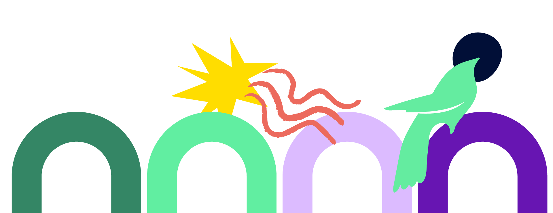
New colour system
A rebrand for a network celebrating the women who make up Brussels: across neighbourhoods, backgrounds and origins, without hierarchy. The strategy, led by Jeta Bejtullahu, set the mission "Women Bridging Brussels": not a space of protest, but one of connection, diversity and pure joy.
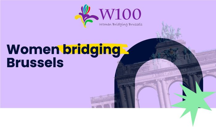
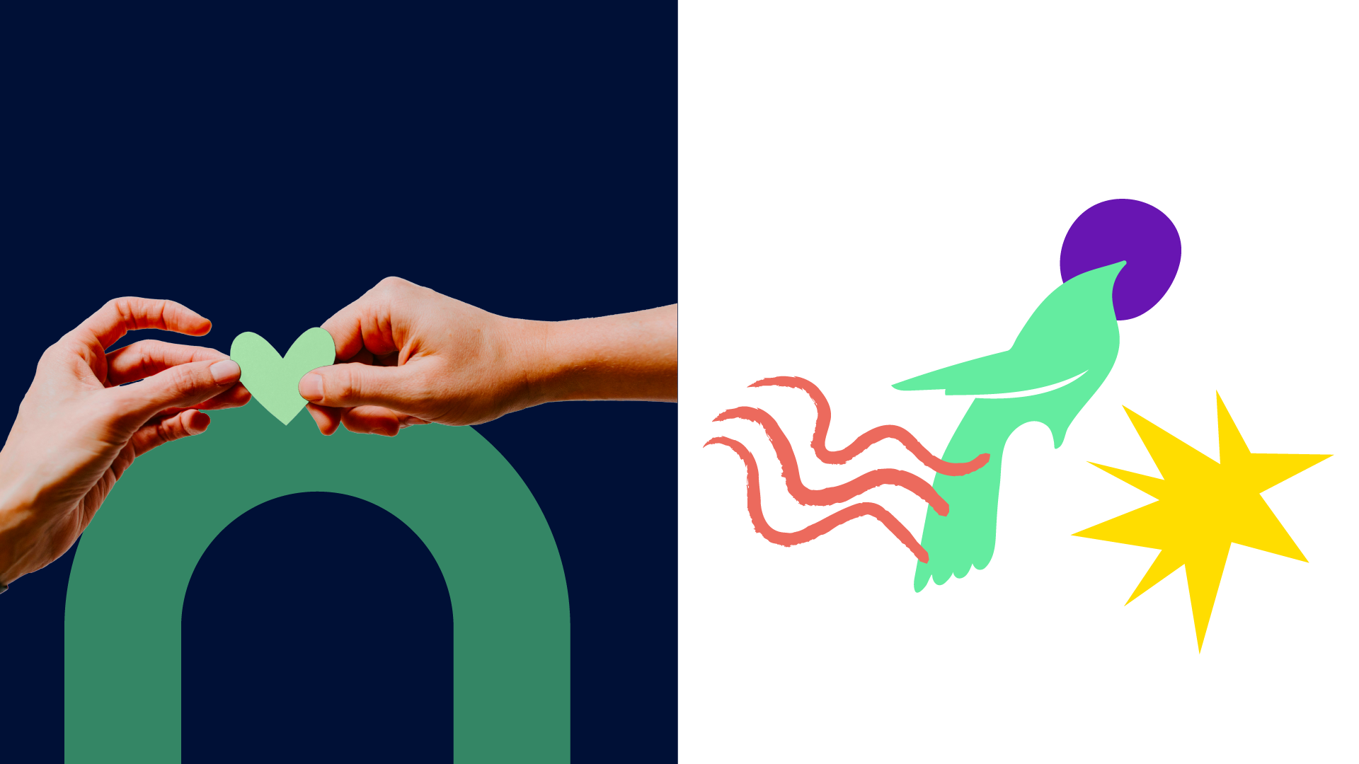
An arch as bridge: "Women Bridging Brussels" made into a mark.
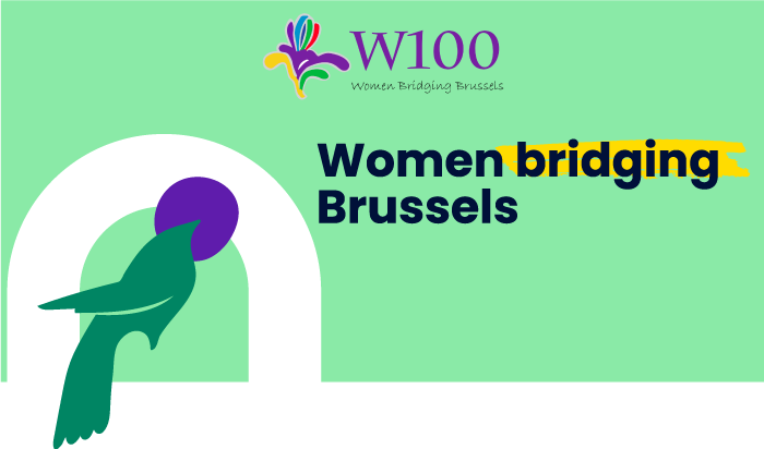
A bird for solidarity, sustainability and empathy. One of the brand's many faces.
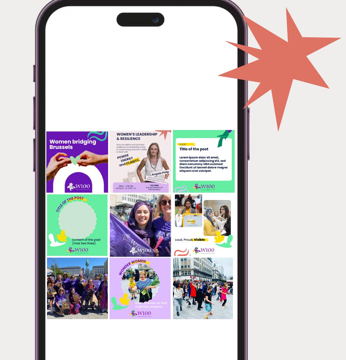
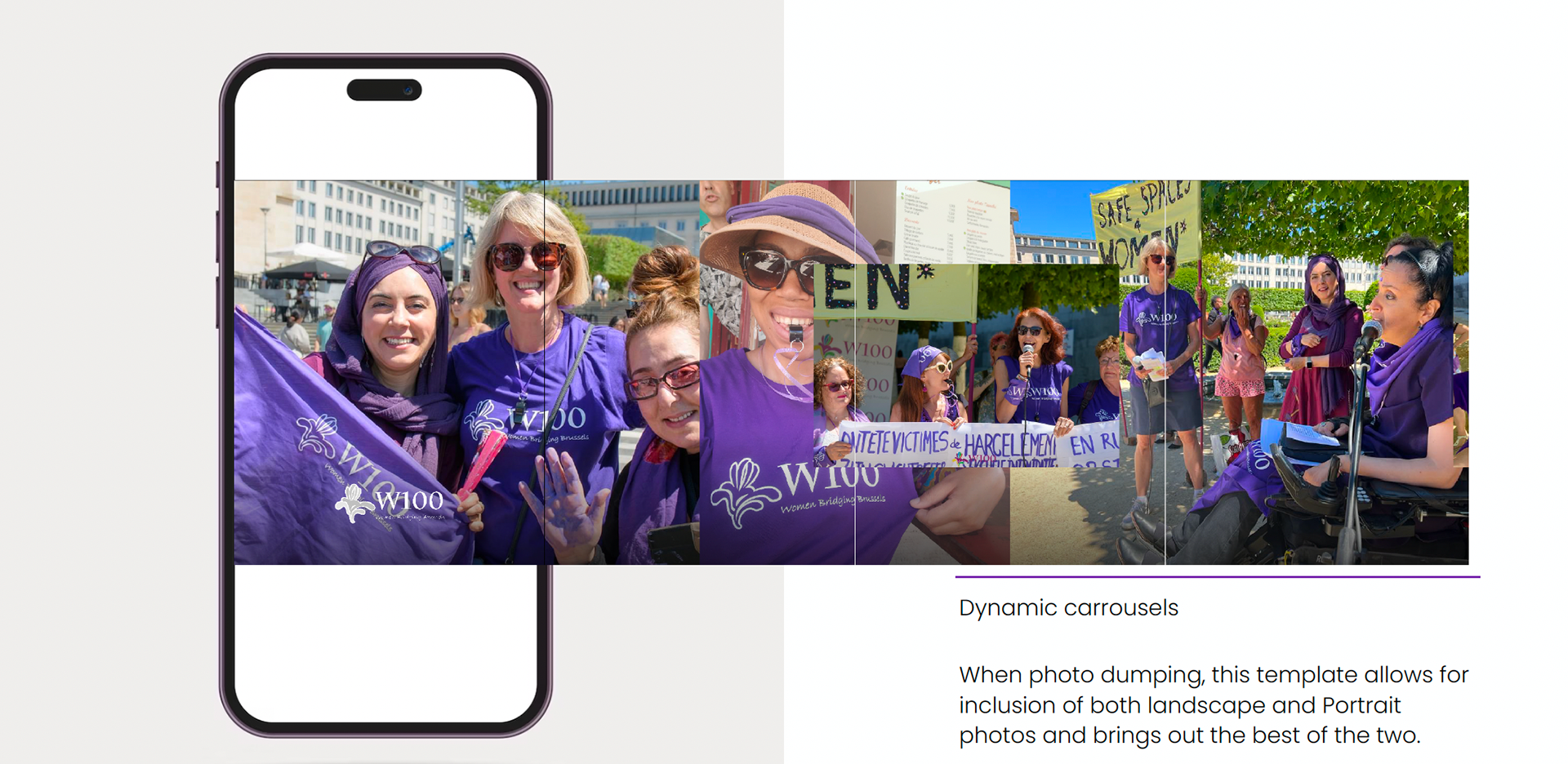
I translated that spirit into a full visual identity: recolouring the logo so the brand's purple could lead, building a new palette with clear rules for use, and creating a set of joyful illustrations — among them a bird icon carrying the brand's values of solidarity, sustainability and empathy. The system extends to social media templates, a newsletter layout and banners, so the team can apply it consistently on their own.
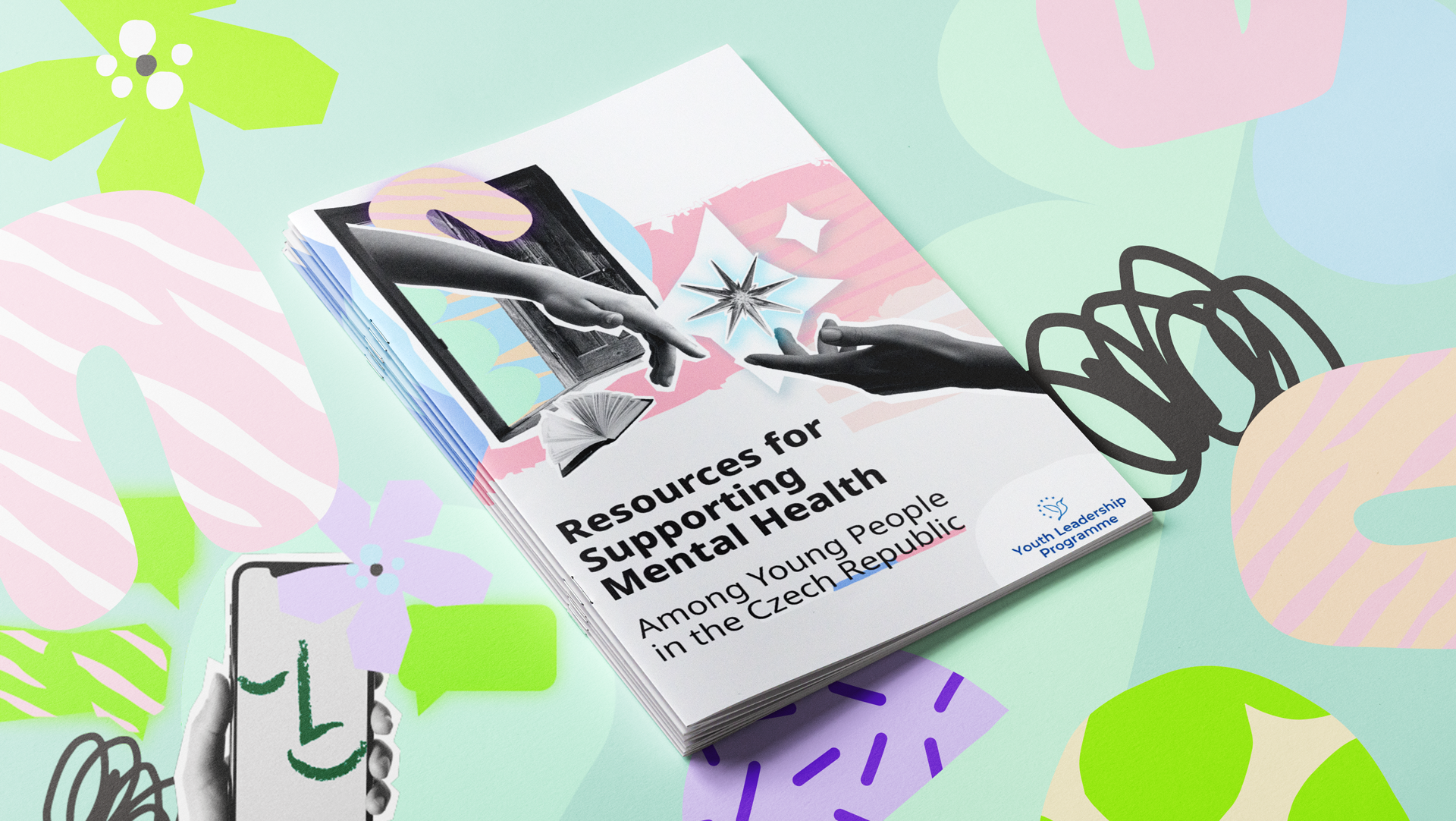
Rather than illustrate page by page, I proposed a mixed-media collage direction: photography combined with naïf vector illustration. By setting this direction early through a moodboard and sharing with the project manager and the Youth Leaders for alignment before production began, it let me build a rich, varied image set across many guides within a tight timeline, and it kept the illustration grounded and human: representing real people and real contexts rather than abstract figures, which mattered for the abstract, and rather sensible topic of mental health.